Bryte Coffee
Pioneering how light roast coffee connects with people through human-centred identity and sustainable packaging systems.
Why Bryte came to us
Bryte approached us to champion the human side of coffee.
Speciality coffee has a strong focus on precision and technique, but Bryte saw an opportunity to balance that expertise with a more social and joyful experience.
The brand needed to feel warm, open and conversational with a focus more on the shared moment than the brewing method. The challenge was to create a visual system that could stand out in a market known for it’s technical detail, without losing its sense of craft.
Logo and typography
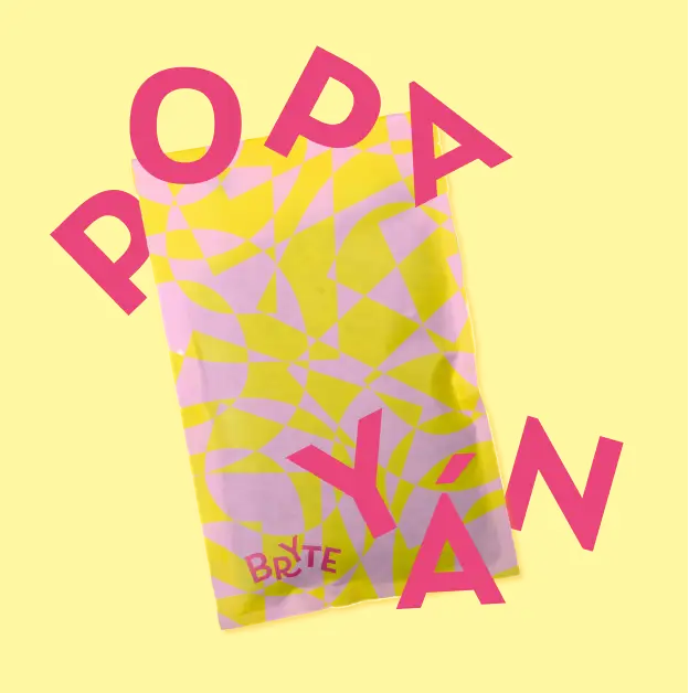
Visually communicating warmth and spontaneity
The identity grew from the most human of things; communication. Playful and energetic, the rounded letterforms and its smiley swashes rearrange to fit into tricky forms and layouts. It’s a living, conversational mark that mirrors how people actually talk—spontaneous, flexible and full of character.
Colour
Bryte by name, bright by design
Scouring the supermarket shelves and researching leading coffee brands revealed an overwhelming amount of neutrals and minimalism.
Living up to its name, Bryte breaks away from the crowd with a vivid spectrum of bright colours used to separate product lines and champion a bold digital presence.
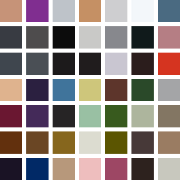
A snapshot of coffee packaging currently on the market.
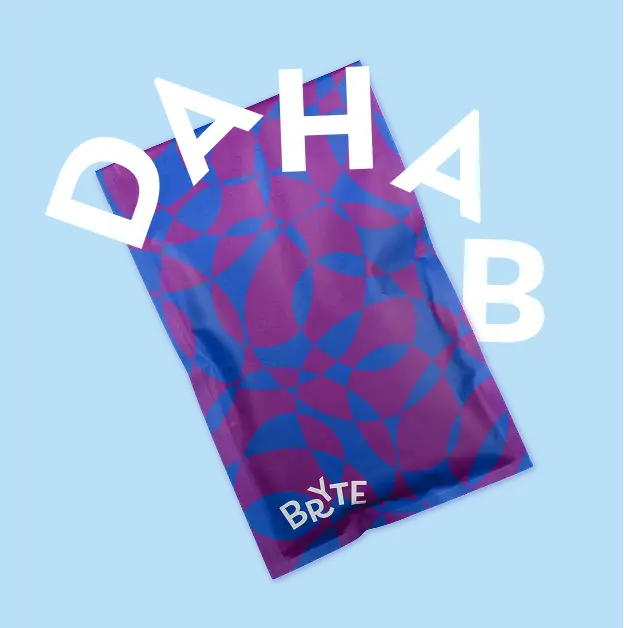
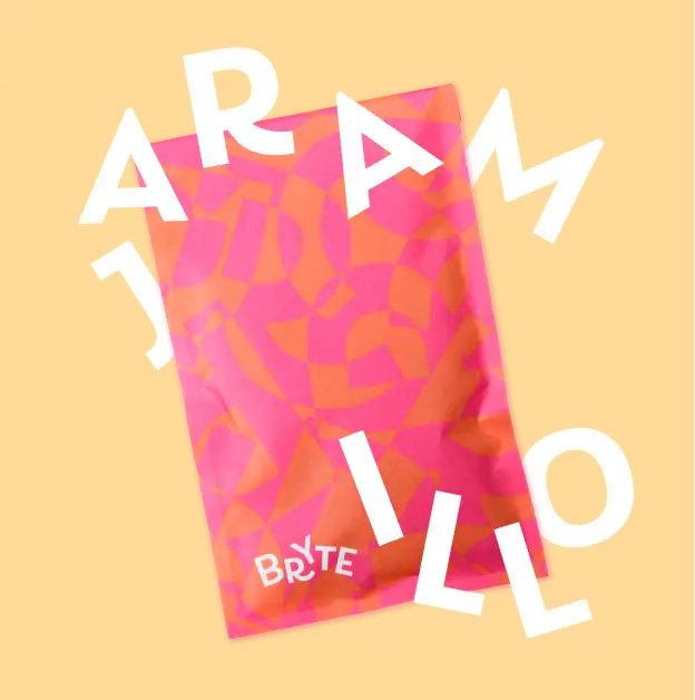
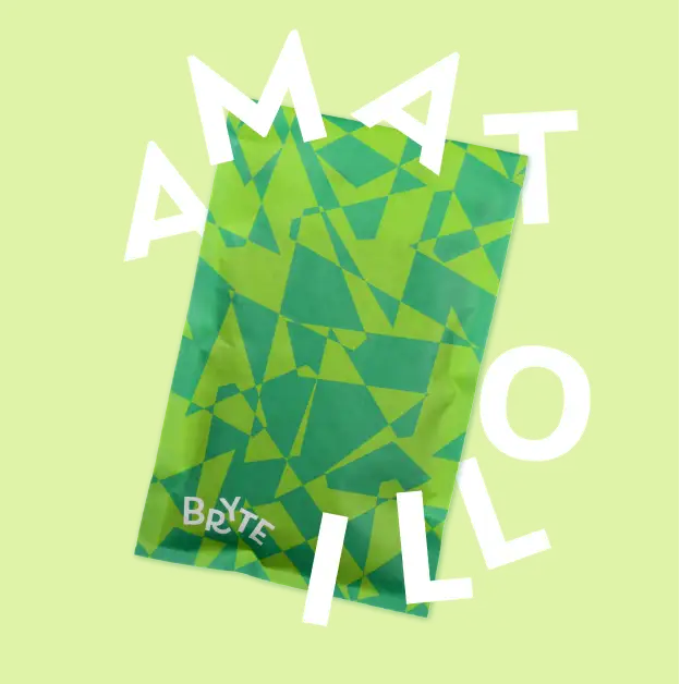
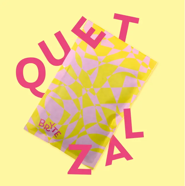
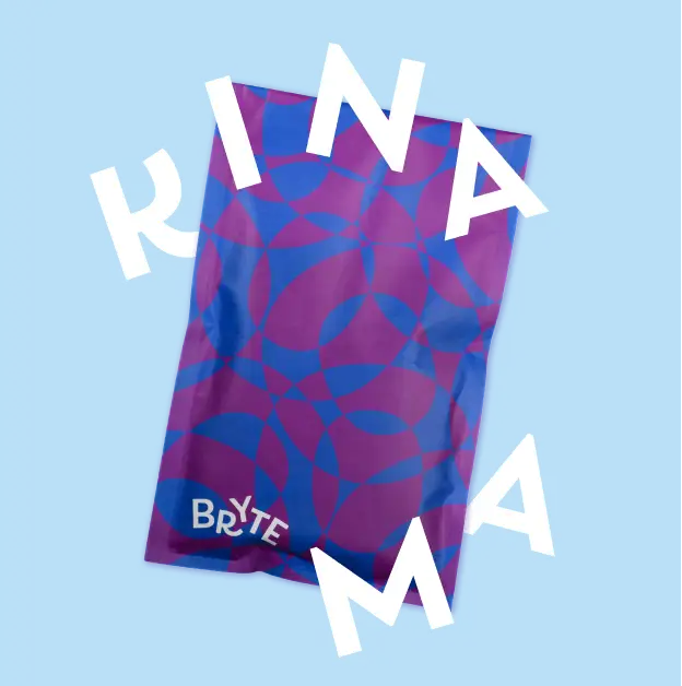
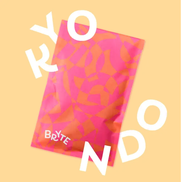
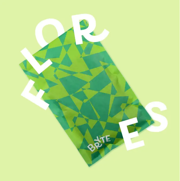
Creating pattern with speech
Layers of fragmented type
While light roast coffee is still a niche choice in the UK, it’s a staple in Norway, where the word Bryte translates to “refract.” That dual meaning became a guiding idea for the brand: the way light (and experience) bends and shifts depending on perspective.
Bryte’s maximalist patterns are overlapping letterforms; fragments of type layered until they become abstract textures. They echo the chatter of a café or the murmurs of a morning commute, turning language into rhythm and colour. The kaleidoscopic results are unique patterns which mimic the individual moments that make up a coffee routine.
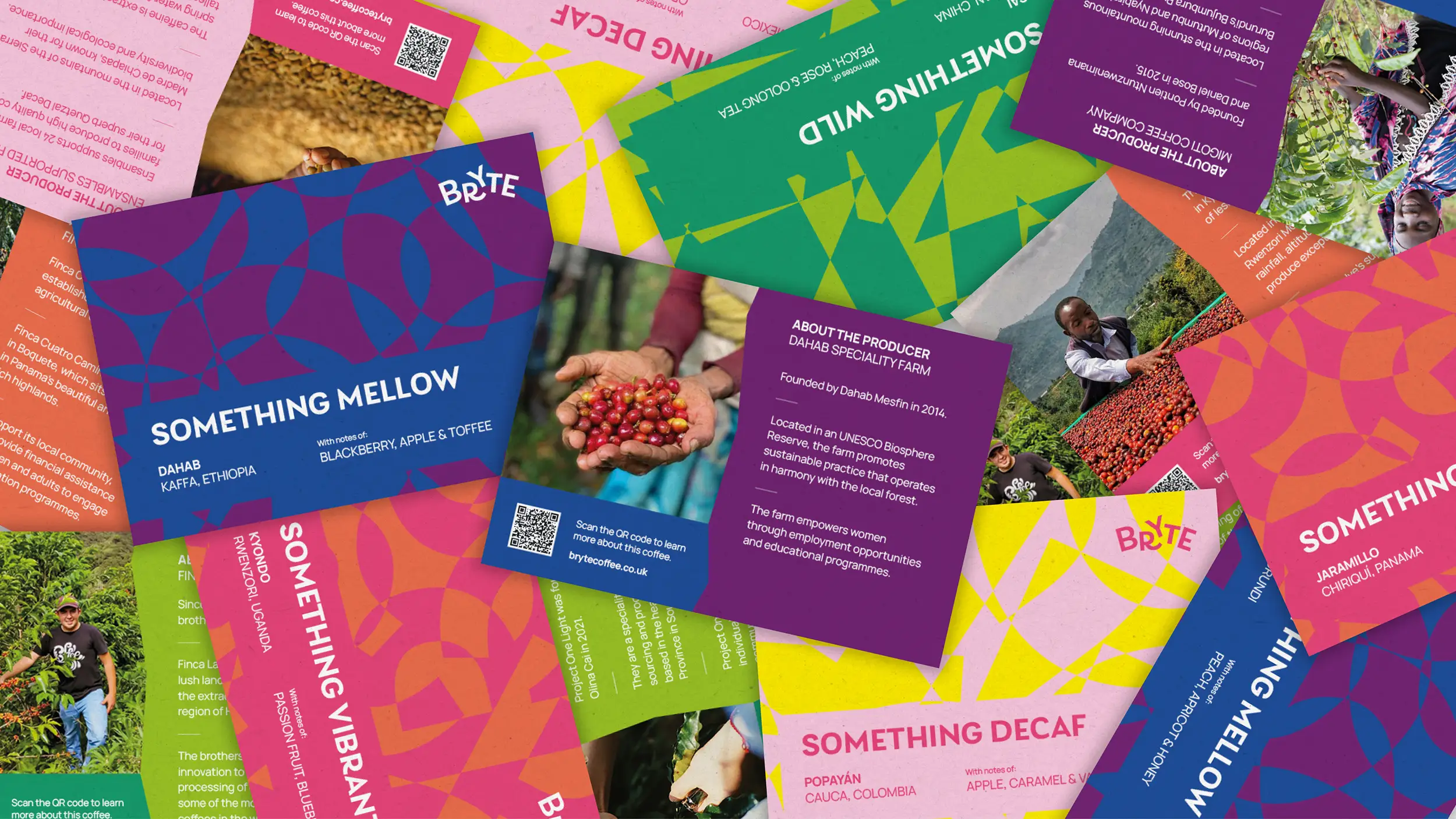
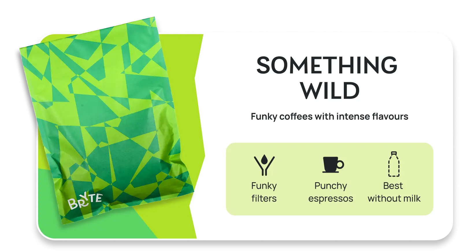
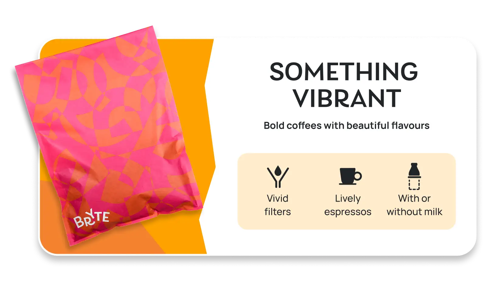
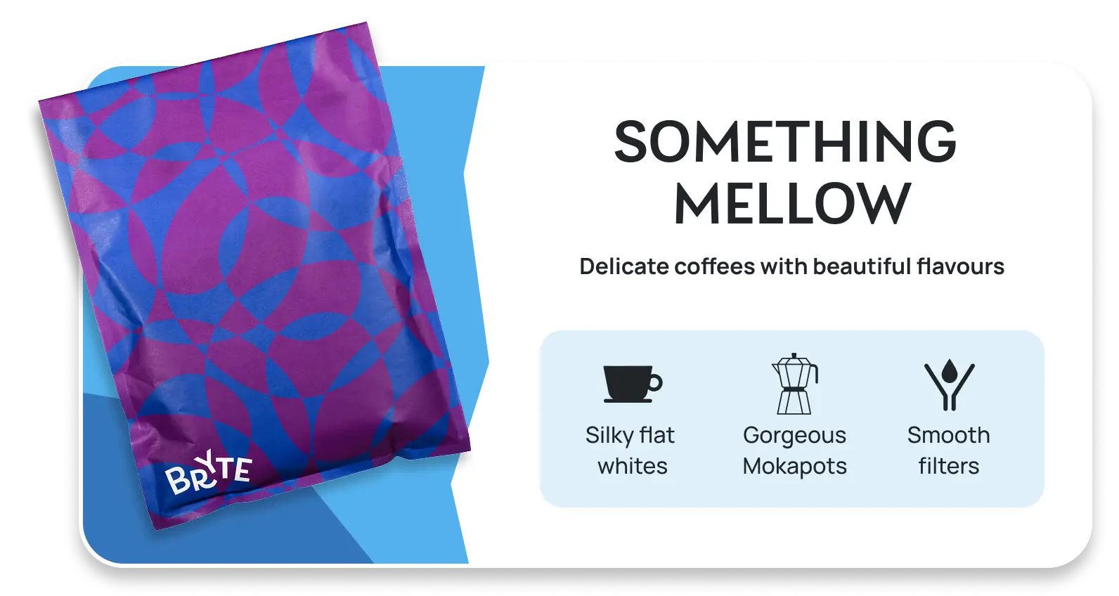
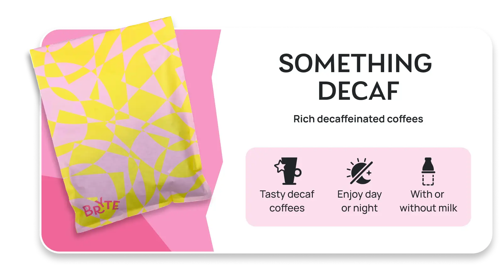
Something for everyone
Categorising Bryte’s coffee
The categorisation of Bryte’s coffee also goes against the grain(–bean?). Where many coffee brands organise by brewing technique, Bryte’s “Somethings” focus on the experience first; the way you like to brew, and the moment you want to create. It’s a system that empowers people to choose a coffee that suits their approach, with the craft there to support them.
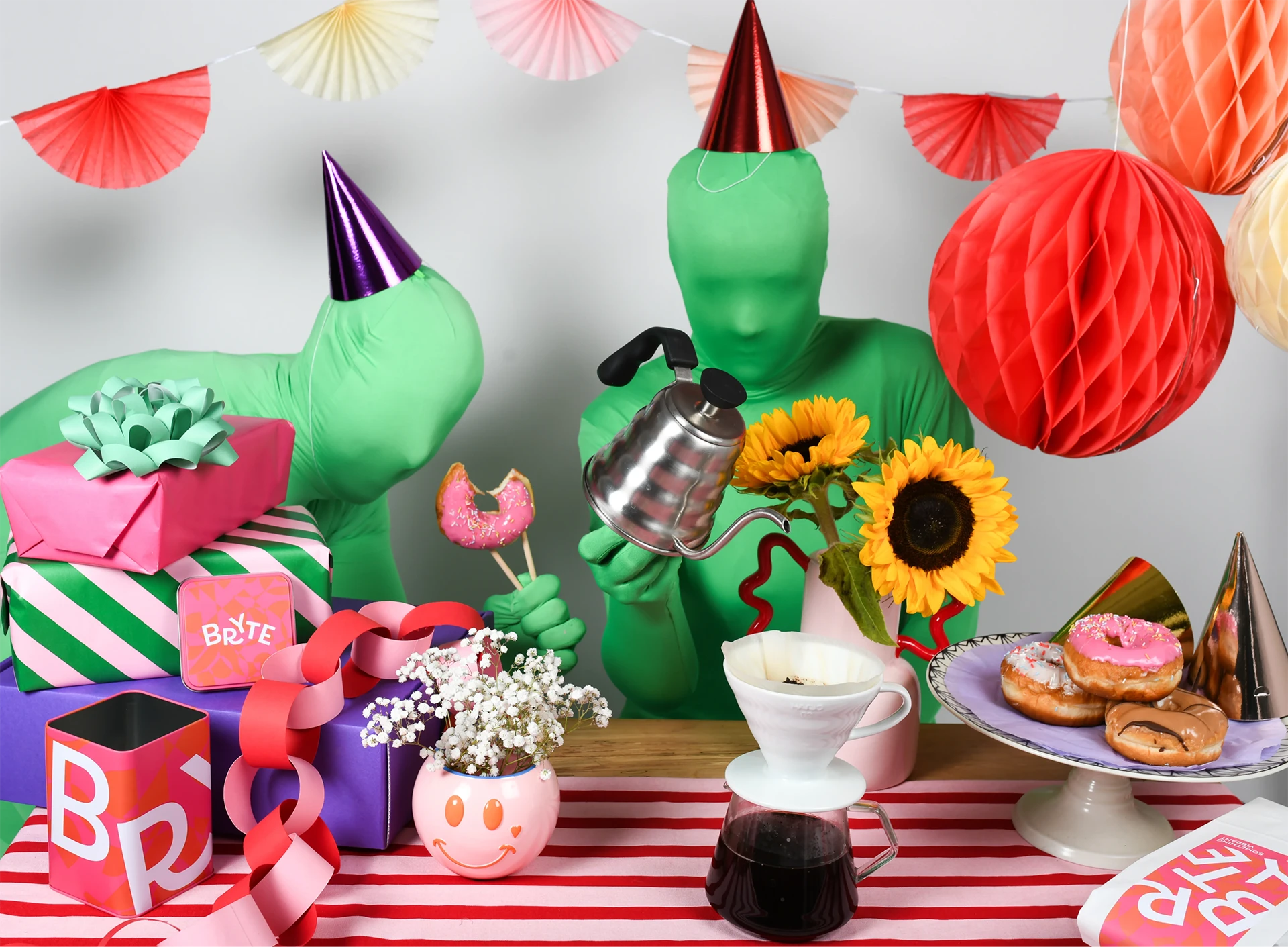
Behind the scenes
Reveal how we got the shot
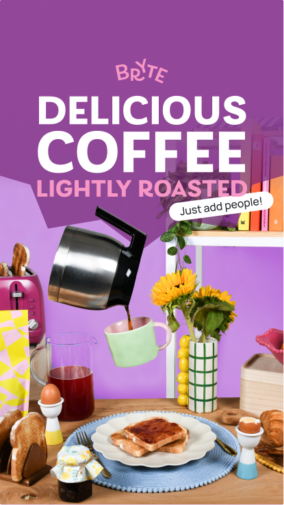
Bryte’s photographic style
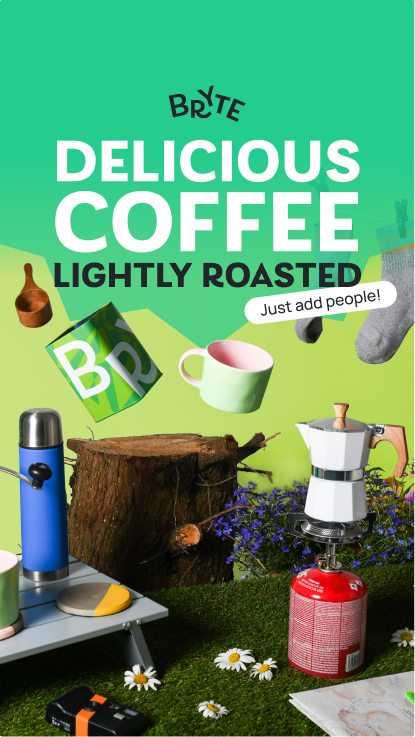
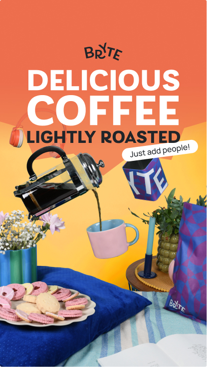
Just add people
As a new face to the coffee roasting scene, our goal was to make Bryte instantly recognisable while remaining open enough to grow with its audience; balancing clarity and personality to let Bryte stand out at launch and evolve over time.
We (quite literally) removed ourselves from the big picture so the buyer can imagine themselves in quirky and eclectic coffee-drinking scenarios, removing the need to centre any one demographic.
Crafting sustainable packaging systems
Packaging with purpose
Sustainability is a key priority for Bryte. By questioning every element of the packaging, we helped Bryte launch with a model that’s both environmentally responsible and visually distinctive, that doesn’t compromise on freshness.
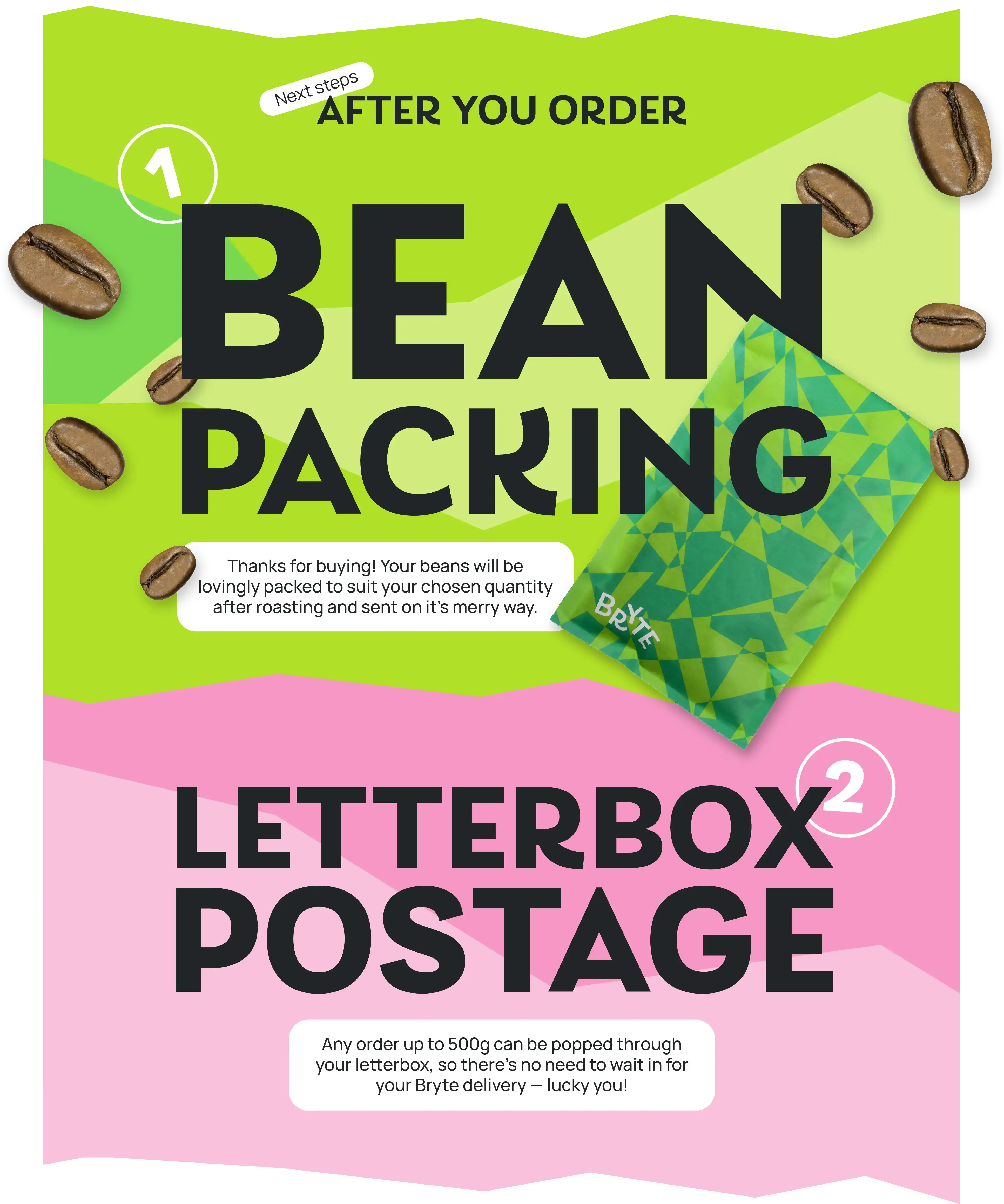

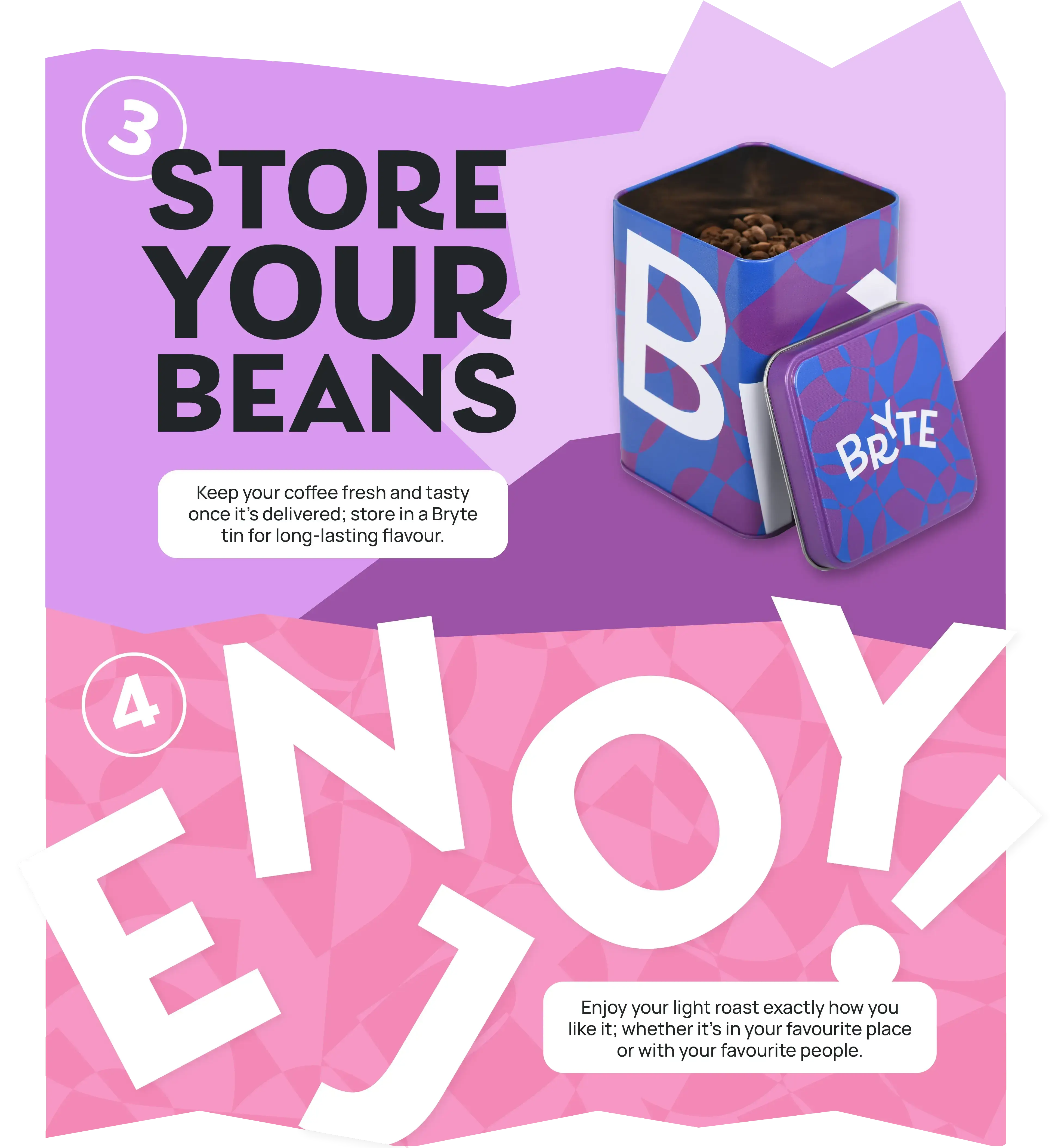
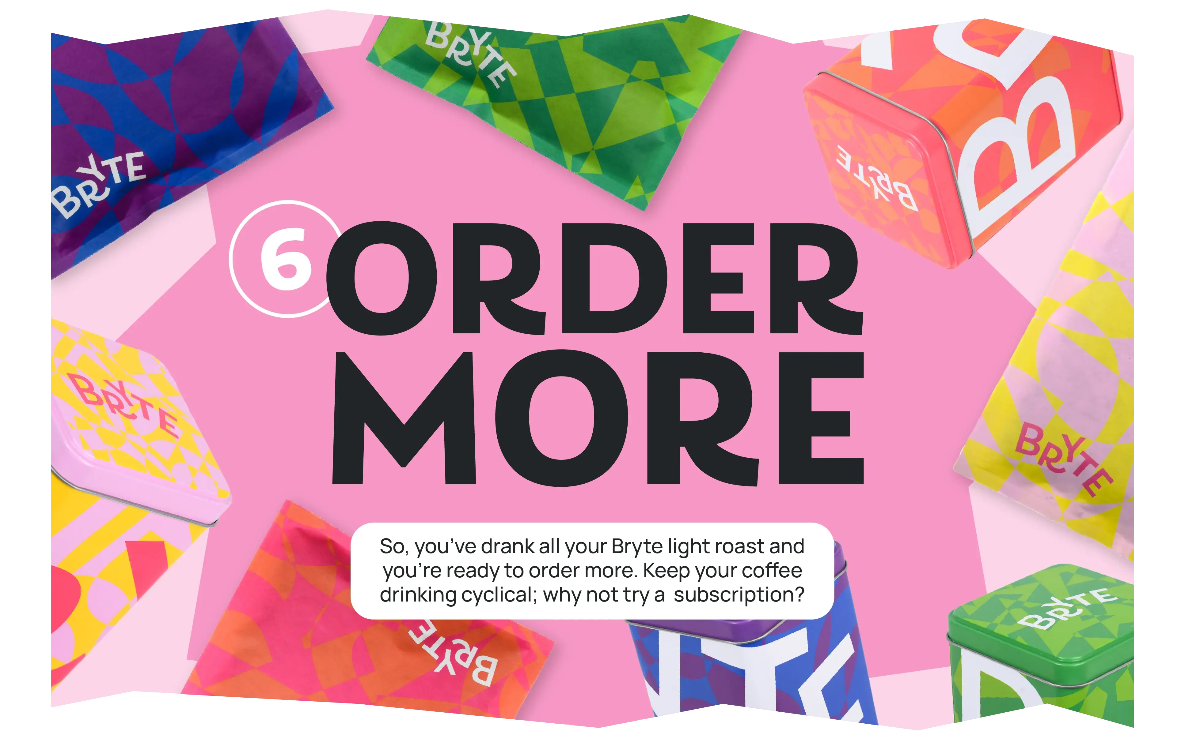
Reusable tins
Providing tins as long term storage helps mitigate the need for valves and seals on short-life postage bags, and a Bryte tin on the kitchen counter adds an extra layer of brand presence.

Removing valves and seals
As light roast coffee doesn’t release gas or sweat much compared to darker roasted beans, we removed the unnecessary plastic valves and seals when creating Bryte’s custom mailer pouches.
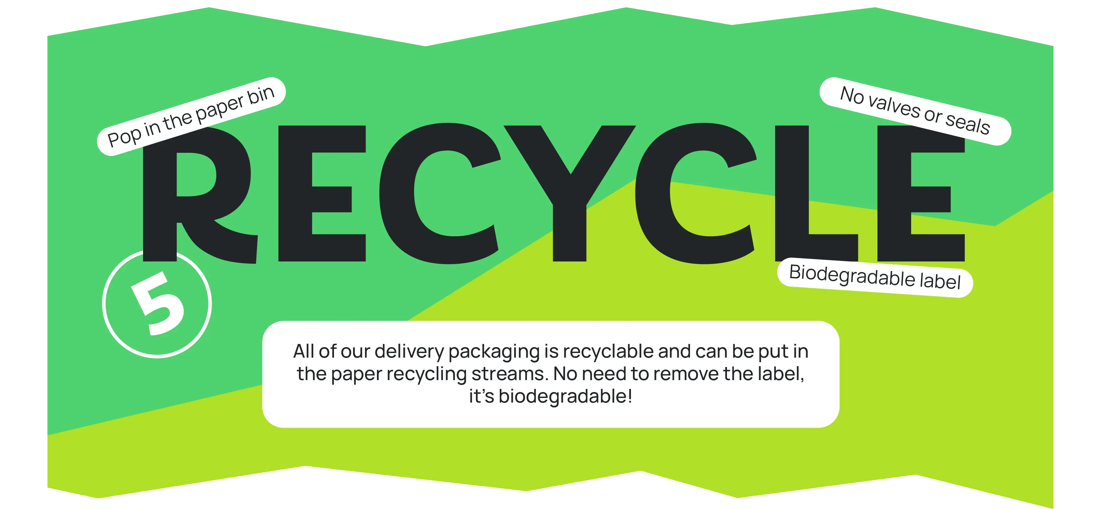

Paper stream recyclable
Bryte bags, boxes and labels are fully recyclable, and can be dispatched straight into the home paper-card recycling stream without separating the individual components.
Key takeaways
A people-first brand in a market known for process
Bryte flips the usual coffee script. It’s a maximalist identity with a clear purpose, and a sustainable system designed from the ground up. Everything about it, from colour to packaging, works to make coffee feel joyful, personal and uncomplicated.
Visit brytecoffee.co.uk

If Bryte is this glorious, vibrant and super-slick entity, then it is only because of Agency of None's attention to detail, exceptional creativity and relentless enthusiasm.
– Sam Robertson, Founder of Bryte Coffee