Gen+
Visual system
Establishing a bold new voice at the forefront of modern education.
Gen+ provides meta-skills education for learners aged 9 to 14 and their teachers. We streamlined their existing content styles into one cohesive visual system that matches the lively and engaging nature of their programmes.

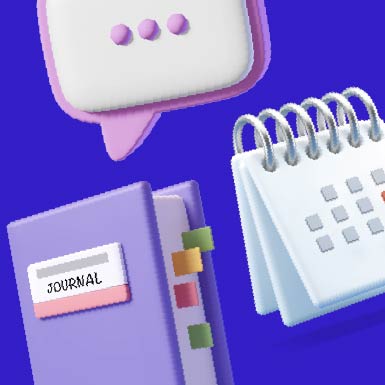
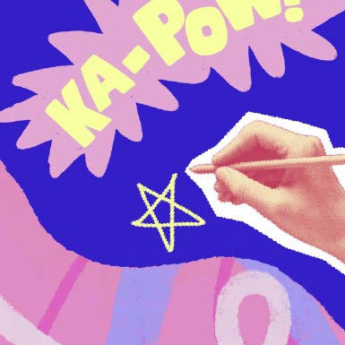
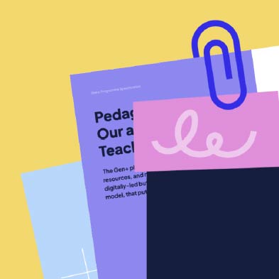
It was important that the central identity was inclusive of their two distinct programme visuals. We leaned into an energetic, collage-like approach, adding new assets of hand drawn accents, various paper textures and large choppy graphics.


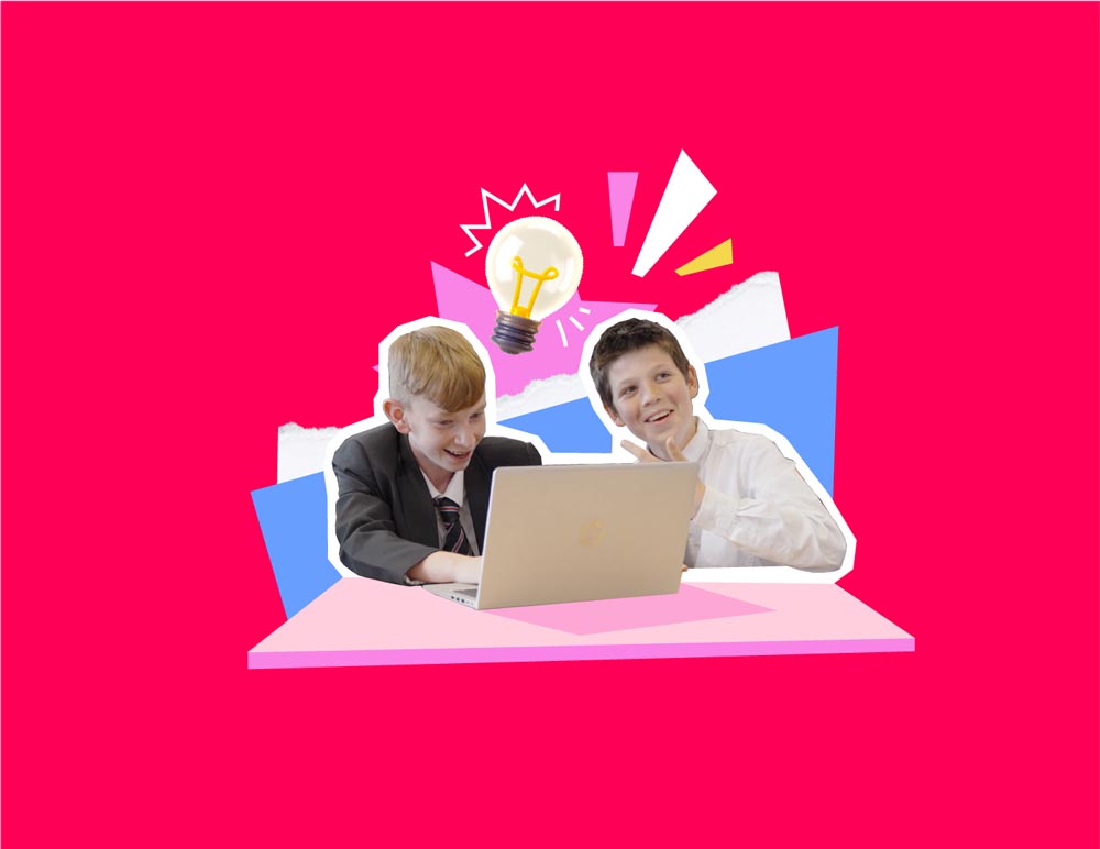

We built compositions around photography showing Gen+ in use, making a library of hero images immersed in the visual language.
To bring a bolder web presence, we expanded and refined the core colour palette to increase contrast for web.

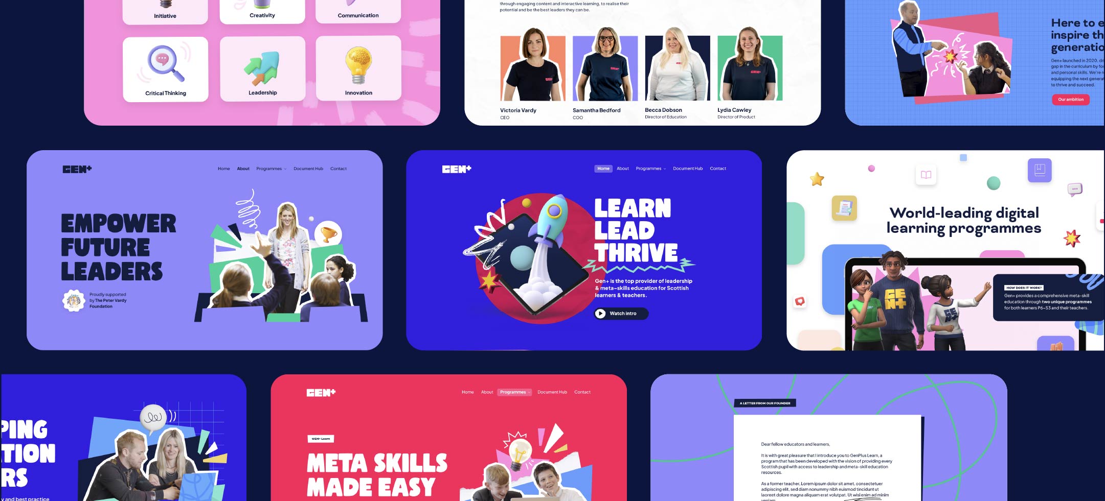
Website
We focussed on creating clear and engaging content- ditching the jargon - to help Gen+ communicate their offerings and values with improved clarity.
With pupils, teachers, parents, and local authorities all looking for different things from the Gen+ website, communications needed to be accessible and efficient.
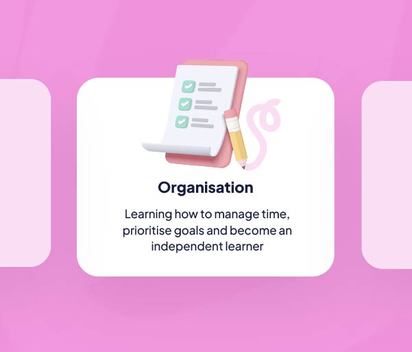
We created more bitesize information with clear hierarchy and straightforward language. The result is a more organised and engaging website with content that communicates who Gen+ are and what they have to offer.

Motion
To make a bold first impression, we distilled a narrative that communicates the full gamut of what Gen+ has to offer and brought it to life with motion.
Working closely with the Gen+ team, we commissioned video footage, scripted and recorded an audio narrative with the organisation's CEO and brought everything to life through motion graphics.
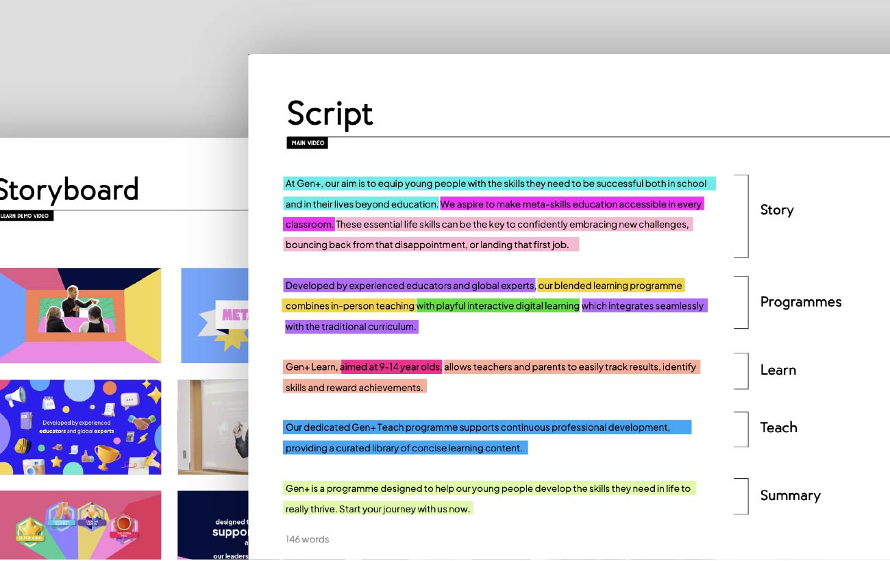
The skills acquired on the platform extend out into the classroom and beyond. To show this, we used a mix of live footage and motion graphics, capturing the ‘blended learning approach’ of Gen+ programmes.
Further applications
Flexibility is key — we created a library of distinctive visuals that can be incorporated, adapted, or softened to suit different formats and audiences.
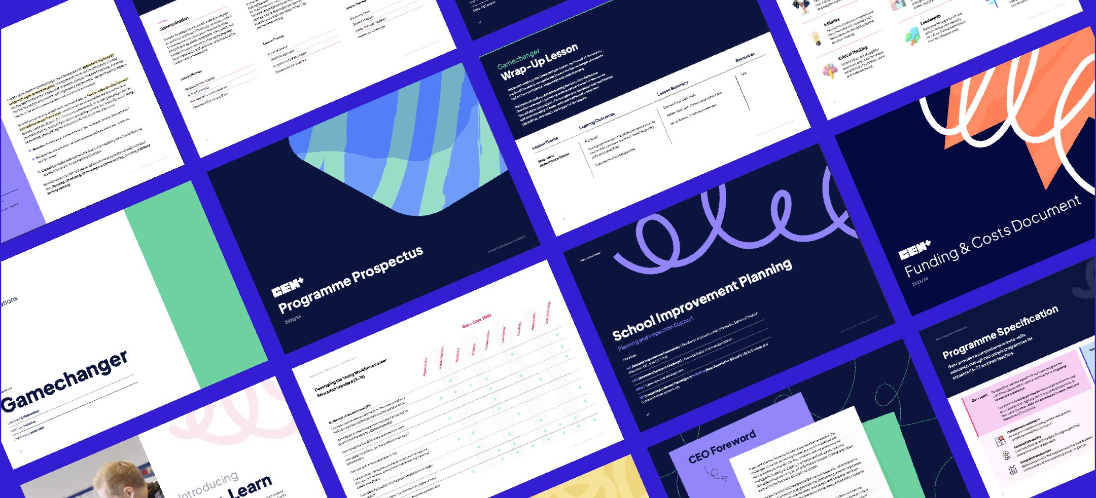
It was important to provide materials that allow Gen+ to maintain a consistent voice when communicating various aspects of the business to stakeholders, schools and prospective partners.
We developed versatile visuals allowing enough flexibility to showcase the fun and engaging nature of the learning programmes, whilst illustrating the knowledge and expertise that underpins it all.