Kitchen Press
The project
A new home for independent cookbooks
For over a decade, Kitchen Press has published some of the UK’s most distinctive cookbooks, combining standout recipes with bold design and beautiful photography. But their website just wasn’t living up to the standard set by their books.
Homepage
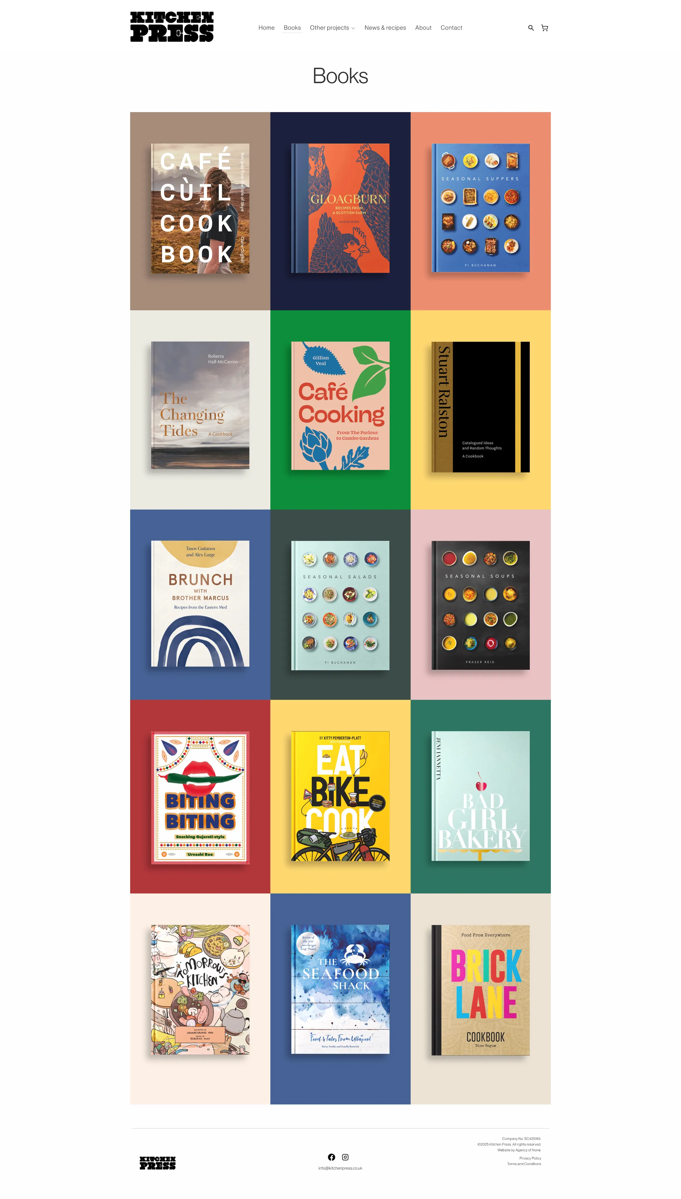
Celebrating covers & colours
We wanted a system for showcasing the books that felt as bold and confident as the covers themselves. So we built a system that pulls a key colour from each book and uses it to flood the header, setting the tone right from the first scroll. The colour sticks with the book across the whole site, carrying through to its product page and any related features.
To keep things legible and looking sharp, we added a smart UI that shifts between light and dark modes based on contrast—subtle, functional, and a little bit magic as you move through the carousel.

Books & recipes
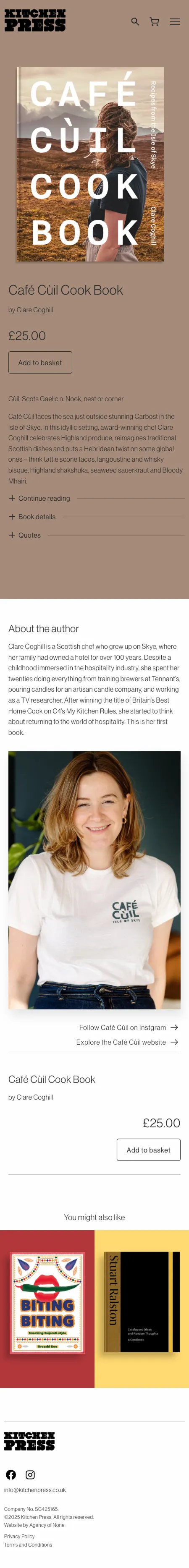
Simple, readable, useful
Full-screen layouts give photography and spreads the space they deserve. Each book page is stripped back to the essentials, with nothing to get in the way of the content. A single accent colour, taken from the cover, sets the tone and carries through each page. Giving every book a distinctive presence that feels intentional, not over-designed.
Too often, online recipes are clunky or over-designed. We kept things simple: a fixed left-hand column for ingredients—always visible, no matter how far you scroll—and a clear, readable layout for the method and notes. It’s an experience designed for how people actually cook, not just how things look.