Make Tank
Starting with a grid system and a range of shapes this identity comes together to make a custom typemark and logo mark that reflects the organisation’s people centred approach and bringing balance to its community. The logo has many variations to keep things interesting while retaining the core message and brand.
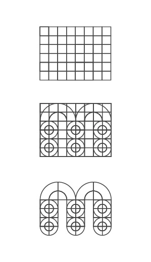
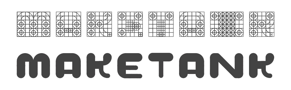
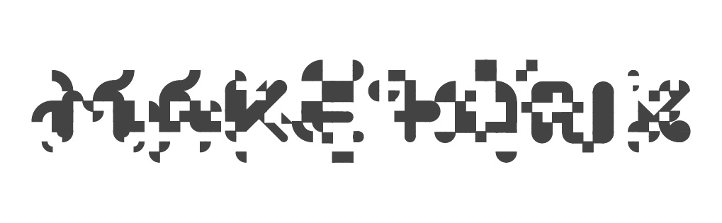
Type
Design
Exploration of letterforms using shapes and a grid.
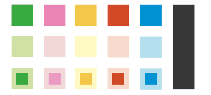
Colour Palette
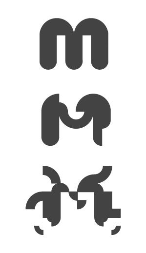
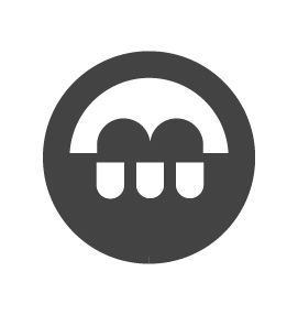
Logomark
Concepts
Exploration of possible logomarks.
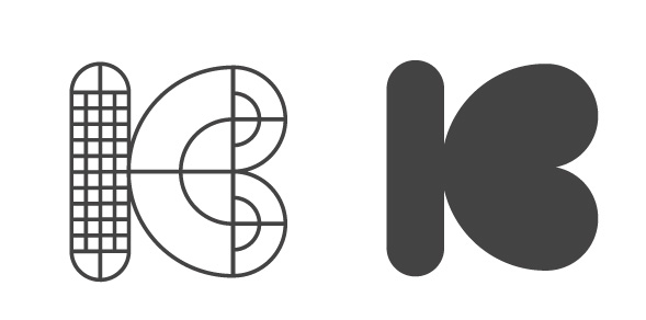

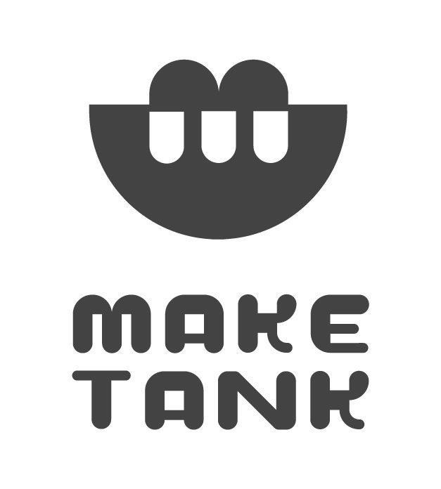
Finished Identity