Street Adverts
Street Advertising Services asked us to design a strategy and visual approach to help them communicate better with their customers and grow brand recognition across their core audiences in Dundee and Perth.
They offer affordable advertising space and operate many sites across the two cities, offering a range of options around printing and placements. Their current website was causing some confusion, so we were tasked with streamlining and simplifying it.

Simplifying the company name
Locally, people referred to the company as Street Adverts rather than Street Advertising Services or SAS. The company already owned streetadverts.com so we decided to unify everything and rebrand the company as Street Adverts.
Our approach was to bring clarity and simplicity to the identity and take inspiration from the S and A letterforms in the previous logo. In the new brand mark there is still a nod to road systems in the typography but overall it is cleaner, simpler and legible from a much greater distance.


Building a visual system
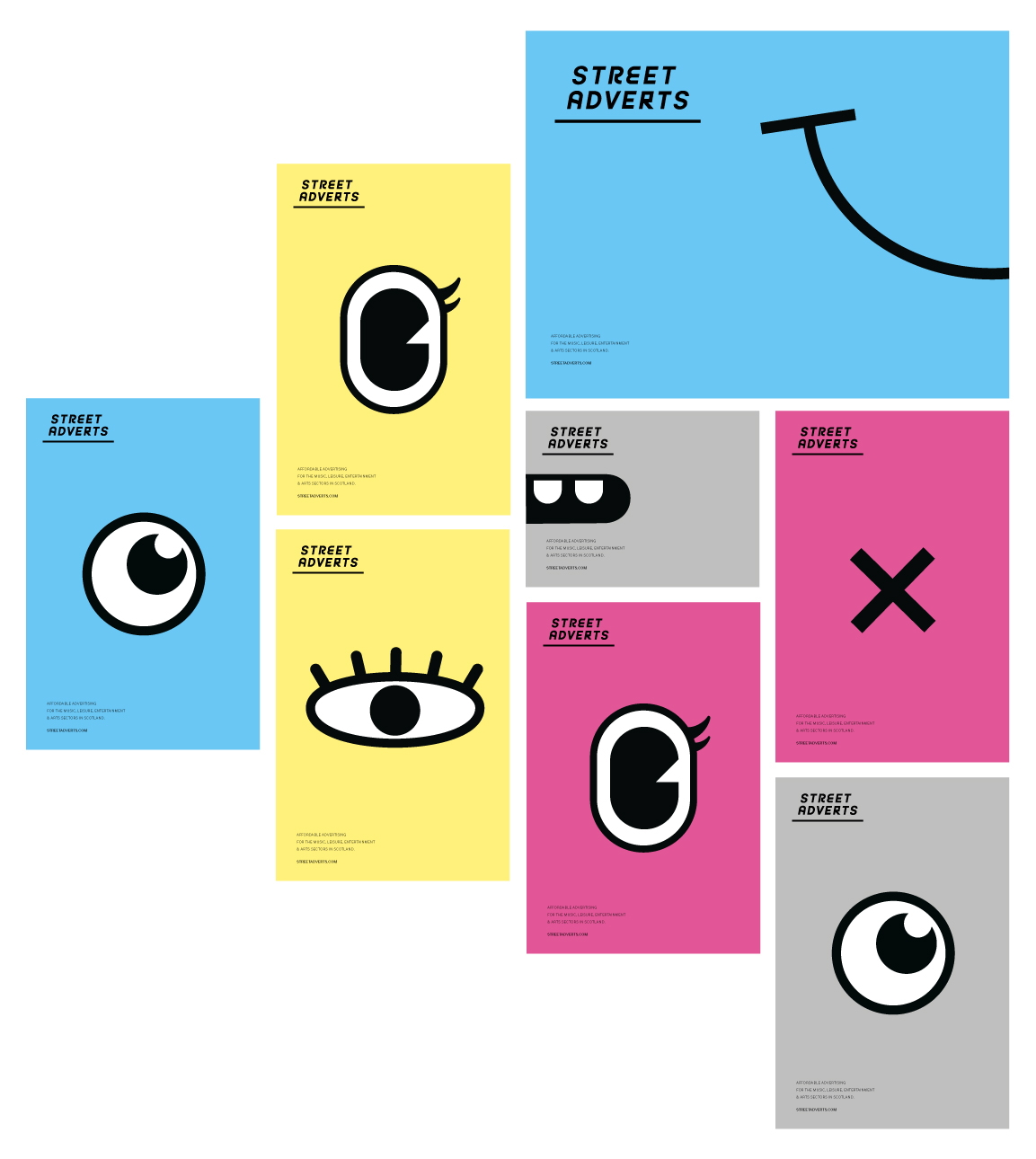
The Street Adverts business is based upon catching the eye of passers by. Using that as a starting point we designed a fun and flexible character based system that could be configured in many different ways across advertising spaces. We also combined this with a CMYK colour palette in a nod to the poster printing process. Hopefully you'll see these little faces peering out across Dundee and Perth.

Simplifying the website
There are many complex options around printing, ad placements and sizes so it was important that the website only contained key information. Encouraging people to get in touch so the services and options can be tailored to each individual's needs. This simplified the sales process, removed any confusion and improved the customer experience.